LogoFORGE
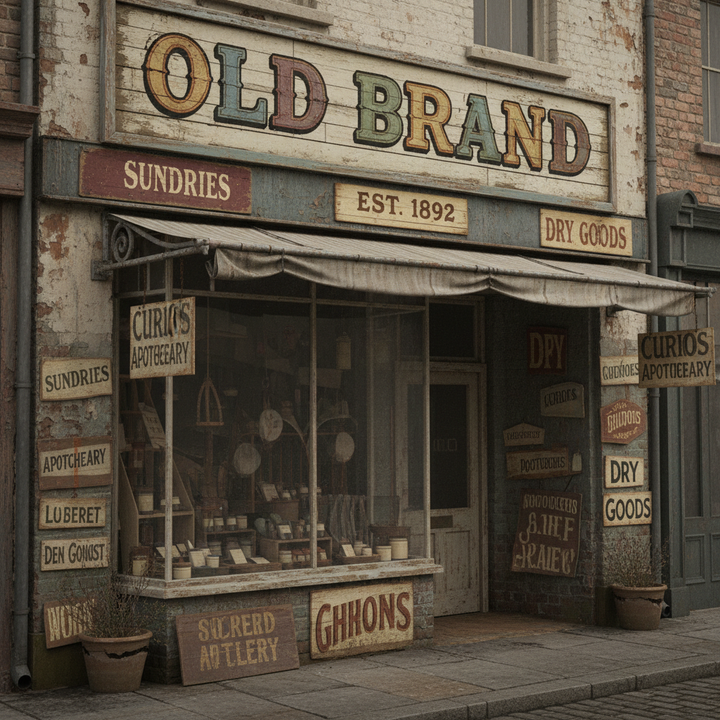
Old brand identity — cluttered collateral, inconsistent color palette, dated wordmark on aging storefront
Before
ACME & Co.

Quality Products Since 1987 · Trusted by Families · Now Serving Online
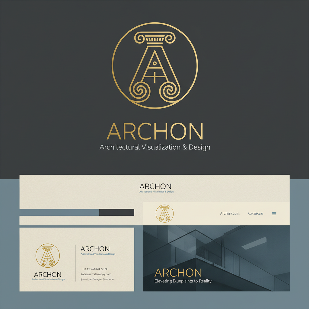
Rebuilt brand identity — refined mark, structured type hierarchy, cohesive minimal touchpoints
After
Meridian

Precision. Presence. Permanence.
Drag to reveal
Scroll
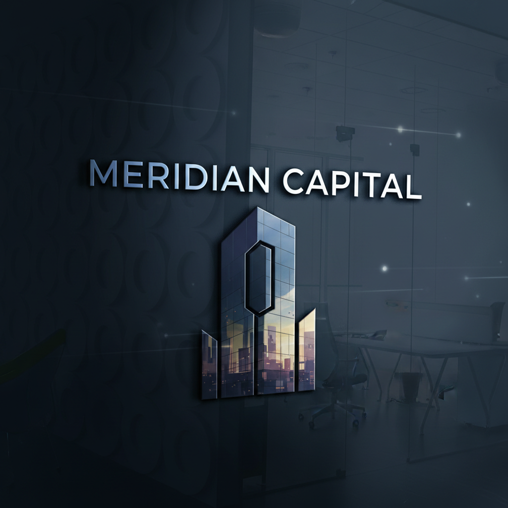
Meridian Capital brand identity — dark glass office tower reflecting city skyline, architectural precision
01
Full RebrandIdentity SystemVoice & Tone
01Financial Services2025

Meridian Capital

When a $200M fund looked like a local credit union.

Diagnosis

Meridian had closed three rounds, hired 40 people, and was managing $200M in assets. Their brand looked like clip art from 2009 — a blue globe, a tagline nobody remembered, collateral that contradicted itself across every touchpoint.

Tension

The partners feared rebrand meant disruption. They had warm relationships built on the old name. We had to make the case that their brand was actively costing them the next tier of LP.

Resolution

We stripped the identity to a single mark — a precise geometric M that reads as a navigation point at any scale. Monochrome. No gradients. A voice system built around precision and restraint. Three typefaces reduced to one.

Outcome

4 new institutional LPs in 8 months. Two explicitly cited brand perception as a factor.
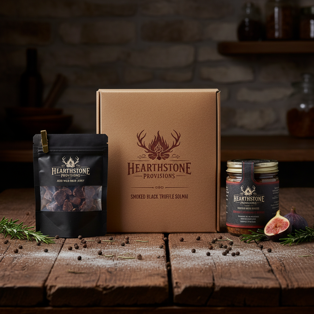
Hearthstone Provisions packaging — dark artisan food photography, premium craft provisions on weathered wood
02
Brand RefreshPackaging SystemNaming Architecture
02Premium Food & Hospitality2024

Hearthstone Provisions

A 40-year family business being eaten by DTC startups.

Diagnosis

Three generations of Ramsay family recipes, a loyal regional customer base, and a brand that hadn't evolved since Reagan. Younger competitors with $500k in seed funding were outselling them on shelf and online despite inferior product.

Tension

The founder's daughter, now running the business, needed to modernize without erasing the legacy that was the only real moat they had. The brand couldn't feel new — it had to feel inevitable.

Resolution

We repositioned around provenance and craft. New naming architecture for the product lines, packaging system built around archival photography and hand-lettered type. The history became the hero. The 40 years became a weapon.

Outcome

3 national retail buyers approached them within 6 months of relaunch. 40% increase in direct-to-consumer revenue year one.

Marcus Webb — CEO, Meridian Capital

“We didn't just get a new logo. We got a new argument for why we deserve to be in the room.”
FORGE

Two projects open — Q2 2026

No calendar links. No pricing pages. Just a real conversation about what's broken.

Partnership Enquiry

Let's Discuss
Your Brand.

This isn't a contact form. It's the first honest conversation — a chance to describe what's broken before we talk about what we might build. Serious enquiries only.

01

Diagnostic call

45 minutes. No pitch.

02

Strategic brief

We frame the problem in writing.

03

Engagement proposal

Scope, timeline, investment.

Currently accepting 2 new engagements for Q2 2026

No calendar links. No automated responses. I read every submission.